Color is one of the most underappreciated elements of cooking. It sets the mood of a meal, shapes our appetite, and turns everyday ingredients into something visually magnetic. Designing a dish around a single color theme invites creativity and restraint—encouraging you to focus on flavor, texture, and presentation with a painter’s mindset.
This post explores how to build a color-themed plate from concept to composition, highlighting seasonality and natural beauty while keeping things balanced and deeply satisfying.
Step 1: Choose a Color and Build Around It
Start by selecting one dominant color to guide your ingredients. This could reflect the season, a particular mood, or even the plate you’re using. A few ideas to get started:
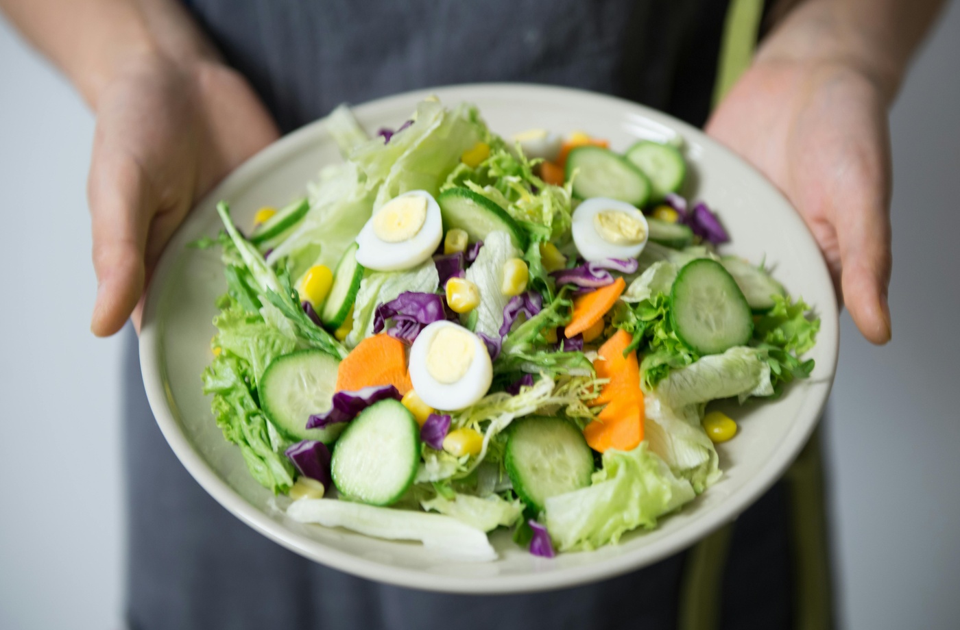
- Green — Peas, herbs, avocado, asparagus, pistachios
- Orange — Carrots, sweet potatoes, squash, turmeric oil
- Red — Beets, watermelon radish, strawberries, smoked paprika
- White/Neutral — Cauliflower, tahini, eggs, sourdough, mushrooms
Once you’ve chosen a color, gather complementary tones in the same family to layer complexity into the final dish.
Step 2: Source Fresh, Vibrant Ingredients
Shopping becomes more intentional when your palette is limited. Look for produce that feels alive with color—bright greens, deep purples, radiant yellows. The more vivid the ingredient, the more visually striking your dish will be.
I source many of these ingredients from local farmer’s markets, but when shopping online or placing larger orders, I look for small ways to save. For example, when buying pantry staples or specialty produce from Whole Foods, I sometimes shop discounted Whole Foods Market gift cards via Fluz. It’s a subtle way to make ingredient sourcing more cost-efficient without compromising quality.
If you’re curious about building this into your own process, you can explore more cashback options on the Fluz app, where select grocery and kitchen retailers are available.
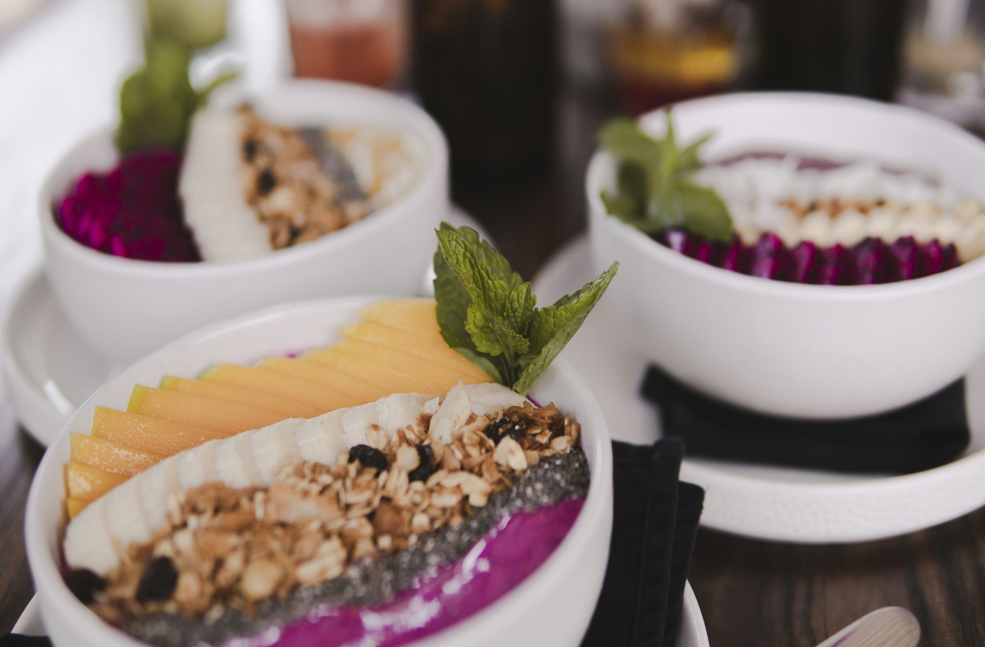
Step 3: Focus on Texture and Contrast
A single-color plate doesn’t need to feel flat. Layering contrasting textures—crispy, creamy, roasted, raw—keeps the dish visually and texturally exciting. Here’s an example using a green palette:
- Creamy: Avocado or pea purée
- Crisp: Shaved cucumber or celery ribbons
- Toasty: Crushed pistachios or grilled broccolini
- Fresh: Mint leaves or microgreens
Temperature contrast also adds dimension. Cold purées with warm roasted veggies create a sensory push-pull that brings the plate to life.
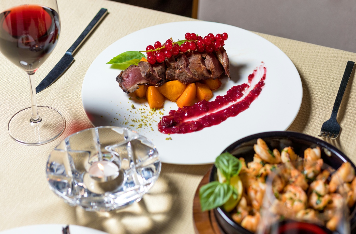
Step 4: Plate with Intention
Once the ingredients are ready, composition is key. Use the plate like a canvas—position your focal elements off-center, let sauce or purée act as a brushstroke, and leave negative space for balance.
Neutral ceramics or stoneware work best here. I often find timeless pieces on Etsy or at small-batch studios like Heath Ceramics, where texture and tone enhance rather than compete with the food.
Use tools like squeeze bottles, offset spatulas, or ring molds to control shapes and lines if you’re aiming for a refined look—or go freeform for something more organic.
Step 5: Capture the Final Composition
Photographing a monochrome plate can be incredibly rewarding. Side lighting enhances texture and creates natural depth, while top-down shots work well to highlight shape and symmetry.
Shoot in natural light when possible, and avoid overhead bulbs that create harsh shadows or flatten the scene. You’ll want the light to reflect the freshness and subtlety of the ingredients.
If editing your photos afterward, keep adjustments minimal—just enough to highlight the tones you worked so hard to bring together.