Food is a sensory experience long before the first bite. The way we perceive a dish—through color, texture, light, and shadow—can instantly shape our appetite and emotions. One of the most compelling ways to elevate a recipe is by designing it around contrast: soft vs. crisp, warm vs. cool, bold vs. neutral.
In this post, we’ll explore how to develop recipes and plating styles that embrace visual and textural contrast, creating dishes that are not only delicious but visually striking. Whether you’re photographing food for a blog, preparing for a dinner party, or simply trying to bring new life to everyday cooking, contrast is a powerful creative tool.
Why Contrast Matters in Cooking and Styling
Contrast makes a plate dynamic. It tells a story of balance and tension—whether it’s between a golden, crunchy topping and a creamy base, or vibrant herbs layered over dark, roasted vegetables.
In photography, contrast draws the eye and adds depth. It’s the difference between a flat, forgettable plate and one that pulls viewers in. In flavor, it keeps the palate engaged—think sweet against sour, or spicy against cooling dairy.
By thinking about contrast holistically—across color, temperature, texture, and shape—you can design dishes that resonate on every level.
4 Types of Contrast to Use in Your Cooking
1. Textural Contrast
One of the easiest ways to add dimension is to play with textures. Pair a smooth soup with crispy croutons, or top soft roasted vegetables with toasted seeds or breadcrumbs.
Ideas to Try:
- Whipped ricotta on sourdough with pomegranate seeds
- Creamy polenta with blistered cherry tomatoes and crispy kale
- Yogurt bowls topped with crunchy buckwheat and soft roasted fruit
2. Color Contrast
Bright, contrasting colors add drama and vibrancy to your plate. Complementary color pairs (like green and red, or purple and yellow) naturally catch the eye.
Ideas to Try:
- Golden turmeric hummus with purple sweet potato chips
- Beetroot carpaccio with goat cheese and arugula
- Charred green asparagus over a white bean purée
Use a neutral plate or background to make the contrast pop. Handmade ceramics from Etsy or Heath Ceramics are excellent choices for subtle, organic backdrops.
3. Temperature Contrast
Layering warm and cold components can be visually interesting and sensorially satisfying. This can be as simple as pairing a hot protein with a cold salad or drizzling a chilled sauce over freshly roasted vegetables.
Ideas to Try:
- Grilled peaches over cold burrata with balsamic
- Warm roasted beets over chilled yogurt with herbs
- Hot sweet potato mash with cold apple-fennel slaw
4. Shape and Form Contrast
Think about geometry. Pairing a rustic smear with a clean-edged element—like a quenelle, cube, or stack—adds dimension. Varying sizes and cuts can also create movement on the plate.
Ideas to Try:
- Smooth purée with chunky vegetables
- Round poached egg on angular toast
- Spiralized veggies with linear grilled elements
Styling with Contrast in Mind
In food photography, contrast adds tension and movement. To style dishes with contrast:
- Use directional side lighting to emphasize shadows and depth
- Layer hard and soft textures (a crisp linen against a matte plate)
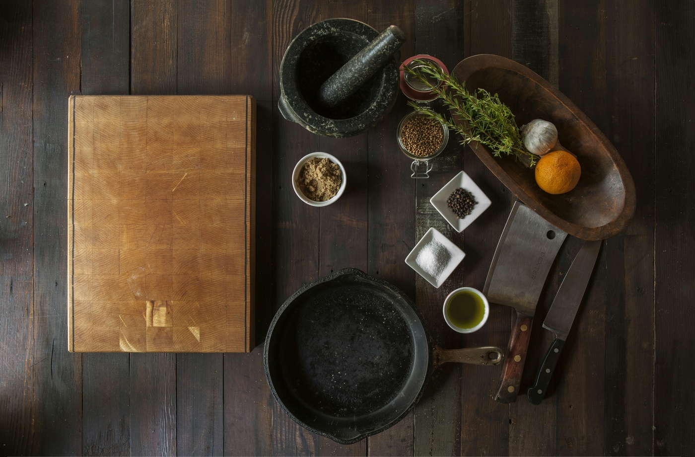
- Choose props that support the contrast—dark wood with light food, or white ceramics with bold sauces
If you’re looking to expand your prop collection to support contrast-driven styling, browse retailers like Anthropologie for textiles, or use discounted gift cards for Home Depot through Fluz to source tile backdrops and wood boards for your shoots.
Develop Recipes That Engage the Senses
When building your own contrast-forward dishes, ask yourself:
- What’s the dominant texture or temperature?
- How can I layer something opposite without overpowering it?
- What does the dish feel like, visually and emotionally?
Start with one element and design the rest around balance. A soft poached egg can be the centerpiece of a crunchy hash. A silky soup can be topped with herbed croutons and a drizzle of chili oil. A sweet dessert can benefit from a salty, brittle garnish.
The beauty of contrast is that it makes a dish feel alive—visually dynamic and satisfying on every level.
Cooking with contrast isn’t just about visual impact—it’s about depth, emotion, and intention. A well-balanced plate invites curiosity, keeps the palate engaged, and makes even the simplest meal feel considered.